Data
The Data tab is the hub for everything analytical about the selected vehicle. It shows the Latest Reading card (for connected EV vehicles) at the top, a compact Latest Location card showing the most recent geo-tagged record on a map, followed by a list of pushable destinations: Stats, Charts, Map, and Readings (Readings only on EV/PHEV vehicles).
Every detail screen below shows the vehicle’s name as a subtitle under its title so you always know which car you’re looking at.
Latest Reading Card
When the selected vehicle has a connected service integration that returns energy data (Volvo, Toyota EVs), a snapshot card sits between the vehicle picker and the menu list. It shows up to three at-a-glance metrics:
- Odometer (km / mi) — current mileage from the latest snapshot.
- Battery (%) plus an estimated remaining range if the API returns one.
- Fuel (L / gal) plus an estimated remaining range — for plug-in hybrids whose API exposes fuel level.
A timestamp on the right tells you how long ago the snapshot was taken.
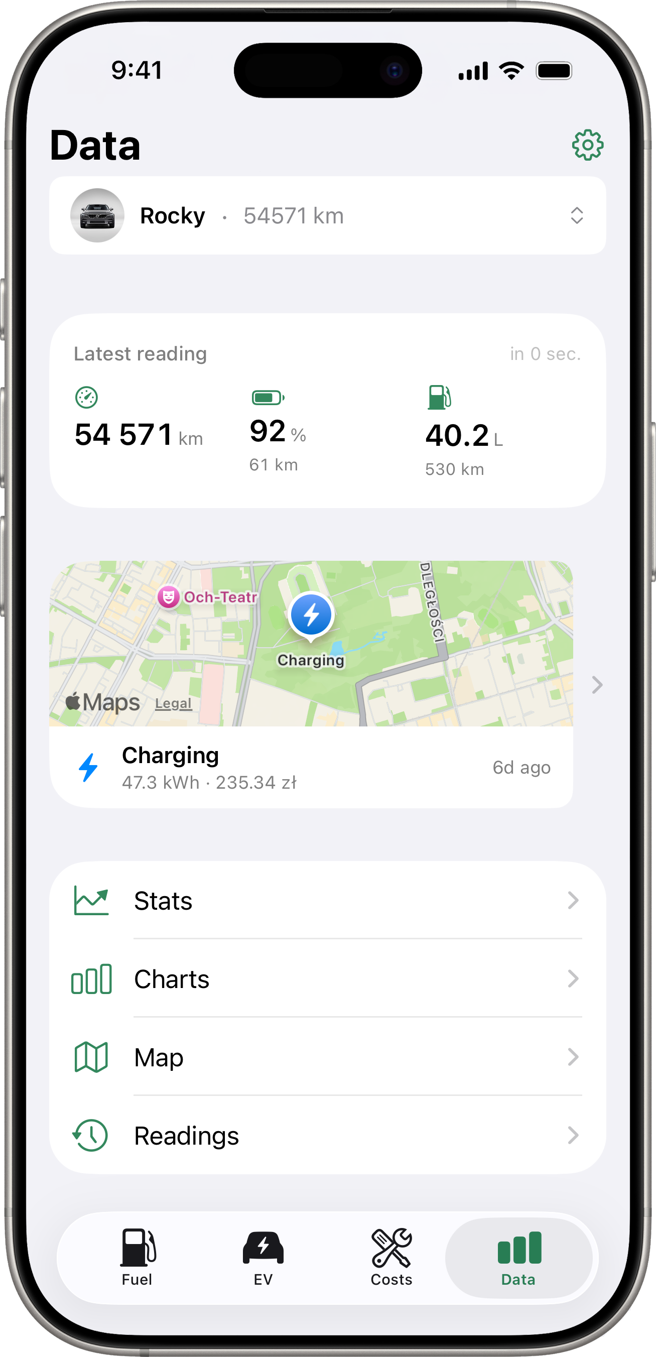
Gestures
- Tap the card → opens the snapshot detail (every field returned for that snapshot).
- Long-press the card → triggers a manual fetch from the vehicle API. While the fetch is in flight, an inline spinner replaces the timestamp.
A welcome hint on first use explains both gestures. It dismisses itself the first time you use either.
For non-EV or non-connected vehicles, this card is hidden and the menu list starts right after the vehicle picker.
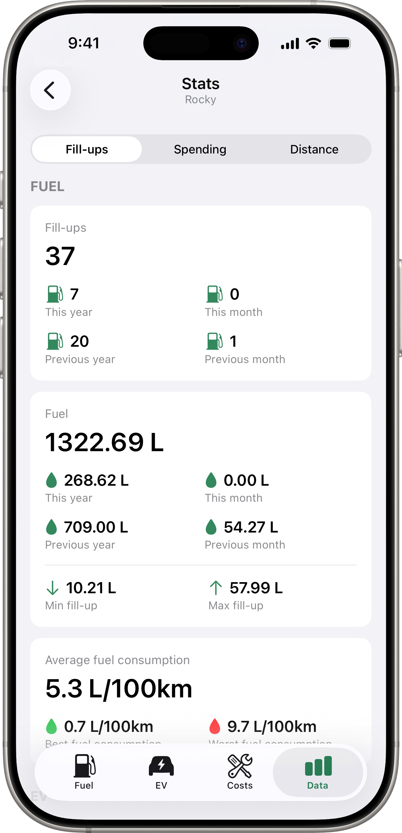
Stats
Tap Stats for a comparison of three time periods:
- Last Month — fill-ups in the last 30 days.
- Last Year — fill-ups in the last 365 days.
- All Time — every fill-up on file.
Each period shows:
- Total Spent — total amount spent on fuel.
- Total Fuel — total volume added.
- Fill-Ups — number of fill-up records.
- Avg Efficiency — average fuel efficiency, when computable.
If you have a default currency set, amounts are shown in that currency. Fill-ups recorded in other currencies are converted using the exchange rate at the time of the fill-up.
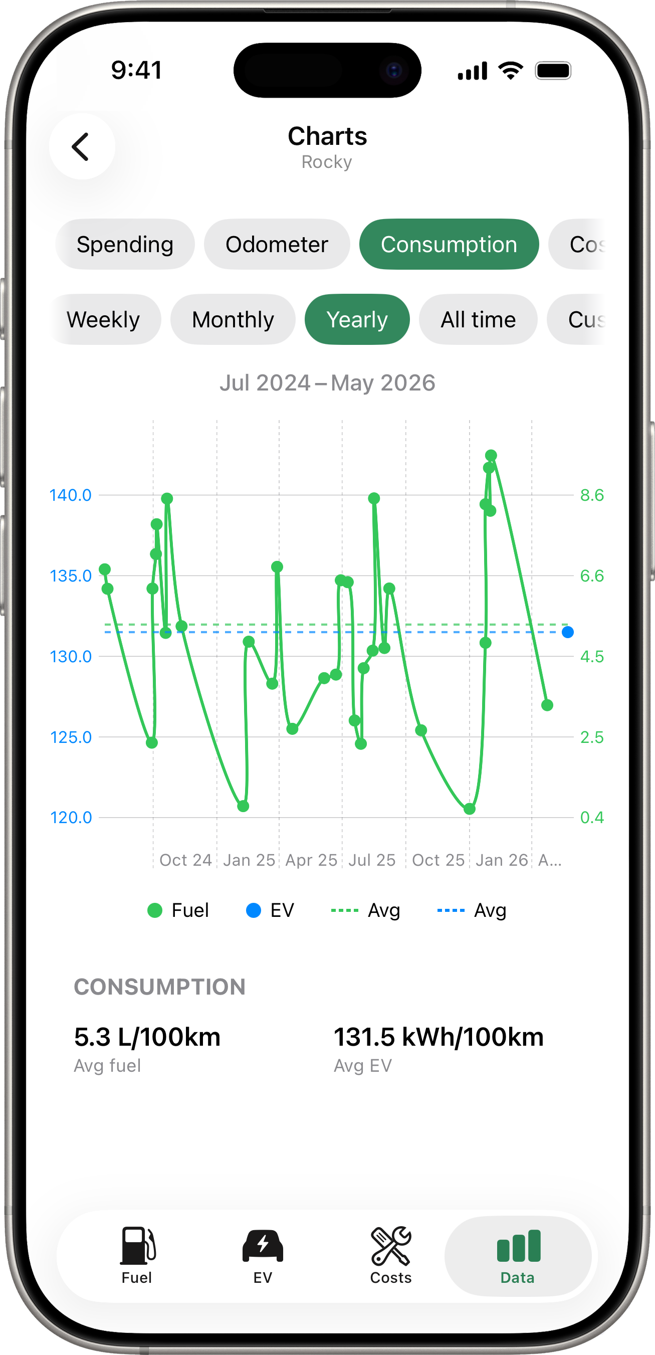
Charts
Tap Charts for visual trend charts. The pill row at the top picks which chart to view:
- Spending — stacked bar of total spend per period, split by Fuel / EV / Costs with dashed per-category averages.
- Odometer — cumulative odometer reading over time. Total = current dial reading; Avg-per-period = km driven.
- Consumption — fuel
L/100 kmand EVkWh/100 km(per session-pair) on a dual axis. - Cost/km — running cost per kilometre, fuel and EV side by side.
- Efficiency — fuel
L/100 kmand EVkWh/100 kmper electricity bill (the long-window view, includes home charging that the per-session Consumption chart misses).
Period pills
A second row of pills selects the granularity and the default visible window:
| Pill | Visible window | X-axis ticks |
|---|---|---|
| Daily | 7 days | day numbers (18 19 20 …) |
| Weekly | 28 days | 26 Mar, 2 Apr, … |
| Monthly | 6 months | Feb 26, Mar 26, … |
| Yearly | 6 years | 2021, 2022, …, 2026 |
| All time | full data history | auto |
| Custom | the date range you pick | auto |
Swipe to scroll
Every chart supports horizontal swipe. The visible window pans through your history in granularity-aligned snaps (Day/Week → first weekday, Month → first of month, Year → Jan 1). A centred date label above the chart tracks the window as you swipe.
When the data is sparse
If you don’t yet have enough data to fill the chosen window (e.g. Yearly with only 6 months of fill-ups), the chart auto-fits the full history into the screen width and disables horizontal swipe. Once your data grows past the window threshold, the same chart on the same period becomes scrollable on the next visit.
All time and Custom are always fit-to-screen.
Switching granularity
Flipping between Daily / Weekly / Monthly / Yearly preserves the centre of the window you were just looking at — so zooming out then back in doesn’t lose your place. If the new window would land in an empty stretch (e.g. you switch from Monthly to Weekly and the Weekly window has no fillups), the chart auto-shifts to the closest data point so you always see something.
Legend
The fuel/EV legend below each dual-axis chart reflects vehicle capability, not just data presence:
- A PHEV with no EV records yet still shows the EV pill — in a grayed/disabled state — so you can tell the data is just empty, not the chart misconfigured.
- A petrol-only vehicle hides the EV pill entirely.
- An EV-only vehicle hides the Fuel pill.
Tap a pill to toggle its series; tap the “Avg” pill to toggle the dashed average line.
Summary cards
A summary card below each chart shows the totals/averages for what’s rendered (e.g. Avg fuel 5.5 L/100km, Avg EV 1.6 kWh/100km). The summary numbers stay constant per-period — they don’t redraw as you scroll the chart.
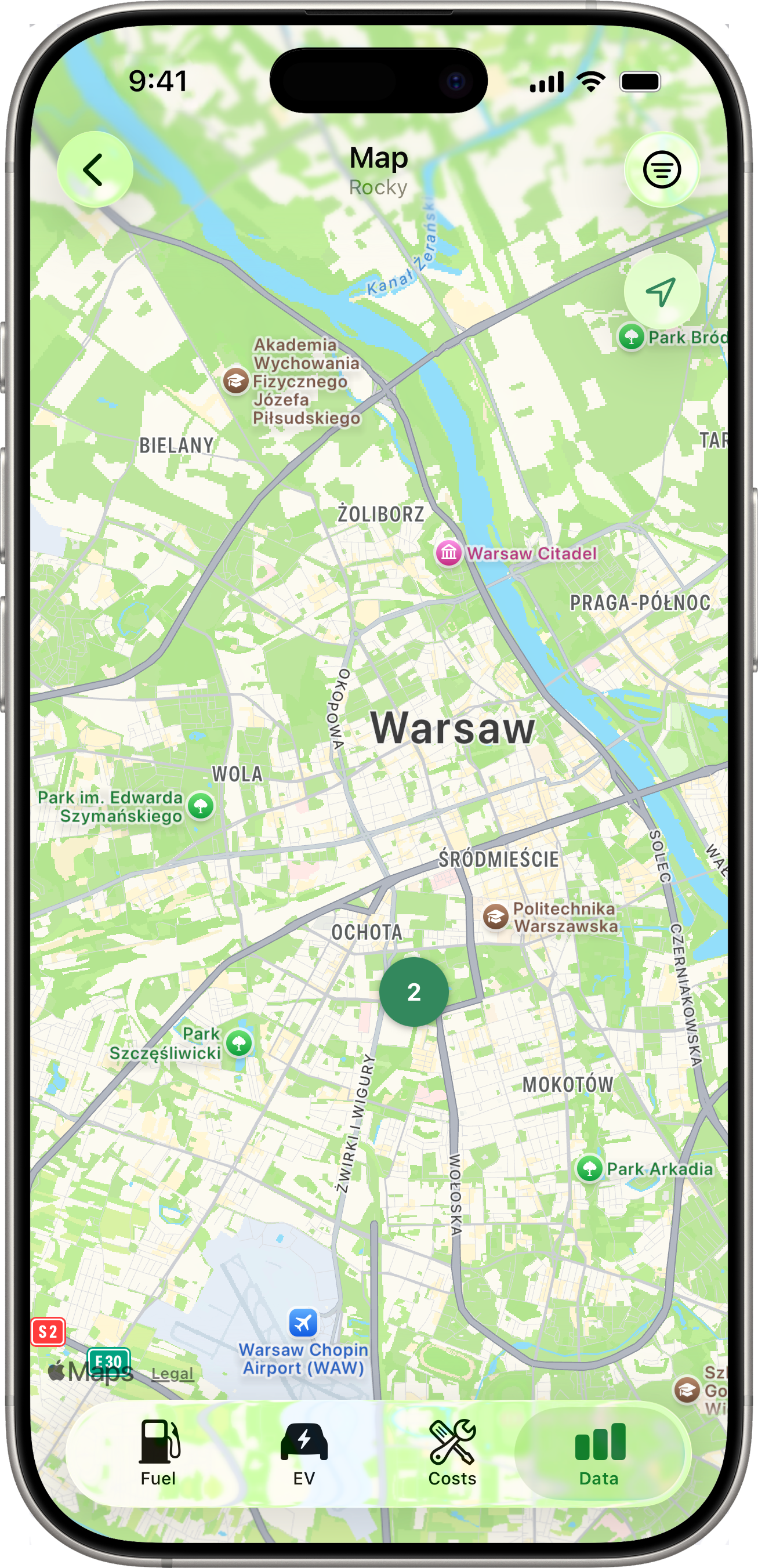
Map
Tap Map for a full-screen map showing every location-tagged record for the selected vehicle — fill-ups, costs, and charging sessions on a single map. The map auto-centres and zooms to fit every pin. If the selected vehicle has nothing geo-tagged, an empty-state message explains how to enable it (see Fuel Tracking → Location Capture).
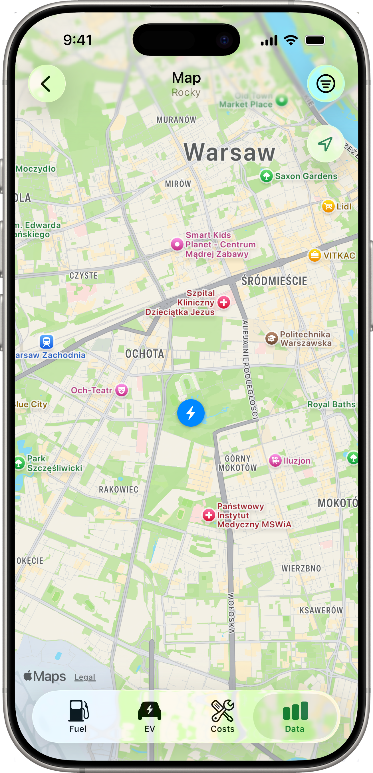
Pin Types
| Pin | Entity | Tint |
|---|---|---|
| ⛽ fuel pump | Fill-up | Accent (green) |
| 🔧 wrench | Cost entry | Orange |
| ⚡ bolt | Charging session | Blue |
A pin’s coordinate comes from the entity’s stored GPS — entries without a location are silently excluded from the map.
Clusters
When two or more pins (of any mix of types) overlap at the current zoom level, they collapse into a single round badge showing the count. Tap a cluster to zoom in; the pins will split into smaller clusters or individual pins as the camera moves. If pins share the exact same coordinate (e.g. several fill-ups at the same gas station), tapping the cluster instead opens a chooser list with mixed-type rows.
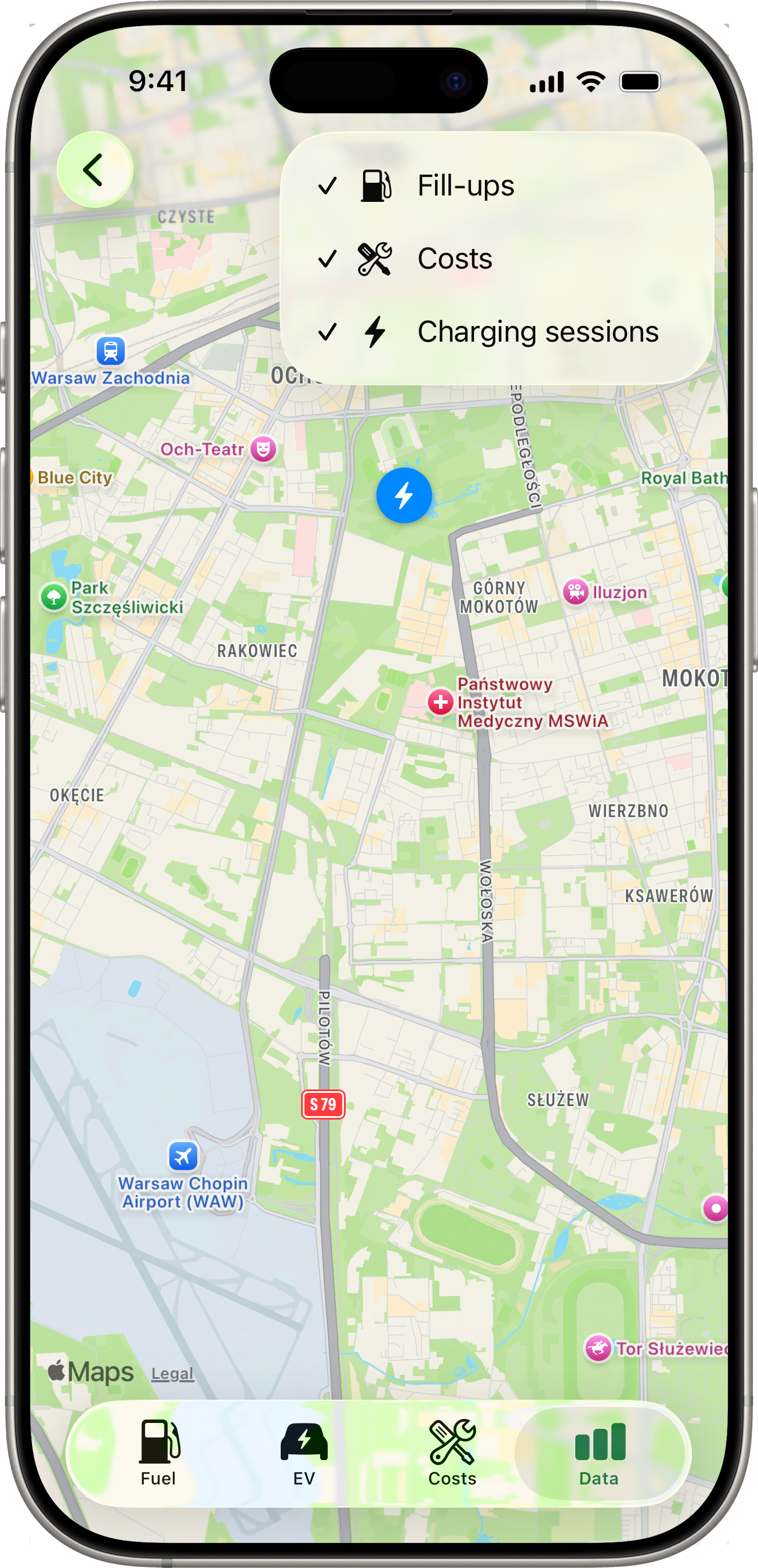
Filtering
A ≡ filter button sits in the toolbar (top-right). Tap it to reveal three toggles — Fill-ups, Costs, Charging sessions. Turn any off to hide that pin type from the map. The filter resets to “all visible” each time you re-open the Map (it isn’t persisted).
When all three filters are off, an inline empty state says “Nothing to show — turn a filter back on.”
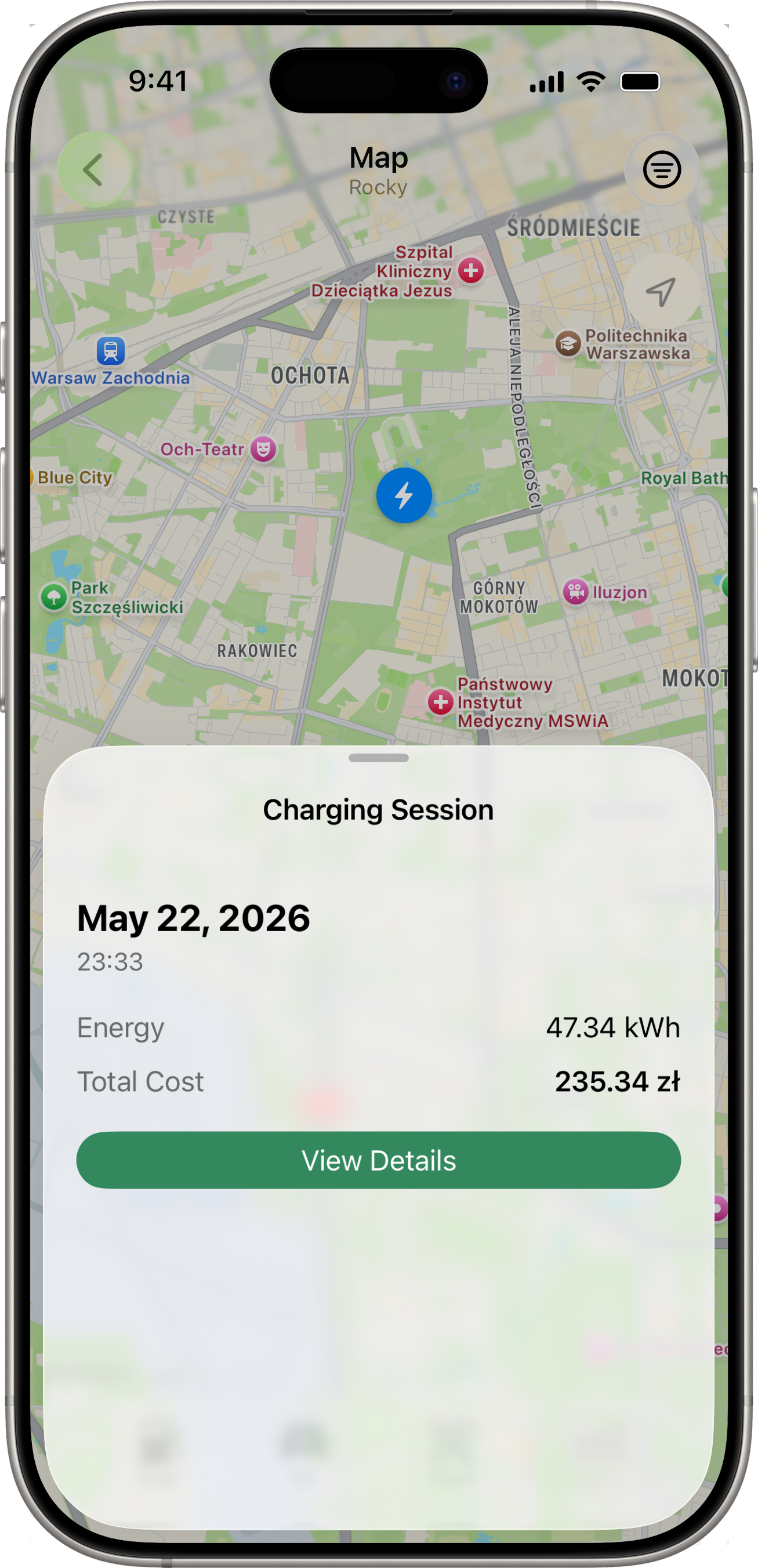
Tapping a Single Pin
Tapping a pin slides up a per-type detail sheet:
- Fill-up → date, fuel type, odometer, volume, price/L, total cost, plus a View Details button that pushes the full editable Fill-Up detail.
- Cost → date, category icon, amount, plus View Details to push the Cost detail.
- Charging session → date, location name (if set), kWh, total cost, plus View Details to push the Session detail.
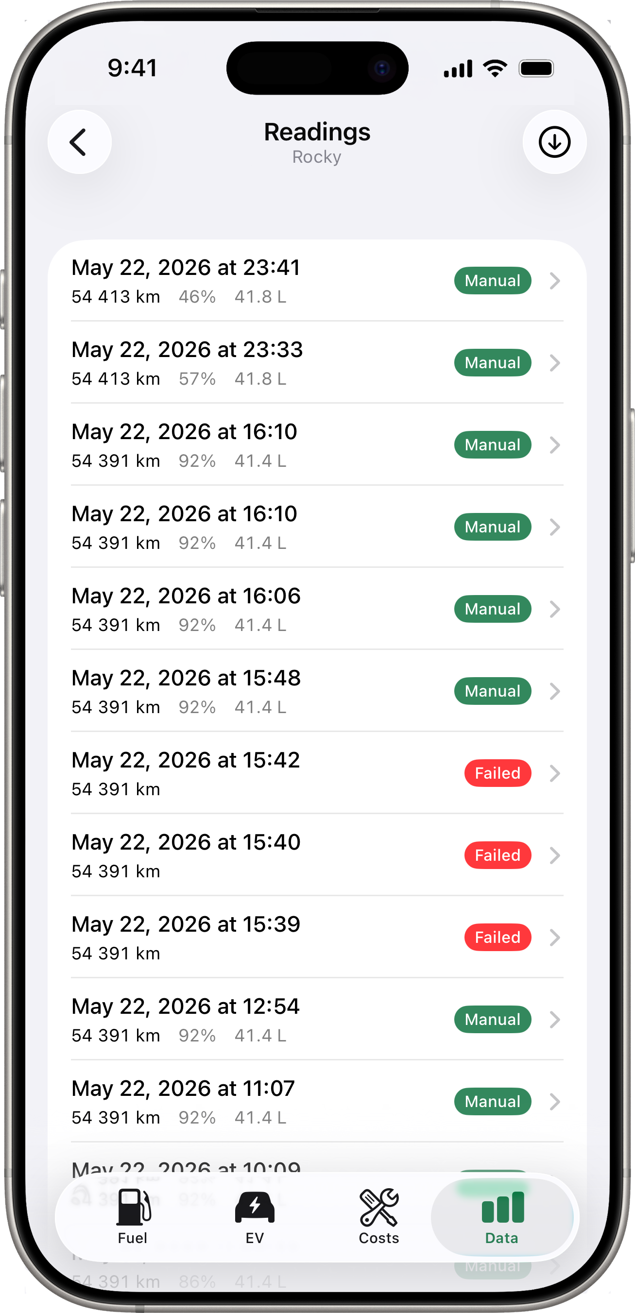
Readings
Tap Readings for a flat chronological list of every energy snapshot fetched from your connected services. Each row shows the timestamp, odometer, battery (and fuel where applicable), and a trigger badge:
- Scheduled (grey) — a routine background or Shortcuts fetch that succeeded.
- Manual (accent) — a user-triggered fetch (from the Latest Reading card long-press or the toolbar button on this screen).
- Failed (red) — a fetch attempt that didn’t produce a snapshot. The row’s subtitle shows the reason.
A toolbar button at the top-right of the list triggers a manual fetch on demand. Useful for testing that the integration is alive or for prompting an immediate snapshot before recording a fill-up.
On a Toyota vehicle without a tank capacity entered yet, the Readings list shows a prompt at the top asking you to set it. Toyota snapshots report fuel as a percentage; without the tank size Drivest can’t translate that into litres or L/100km, so the daily-from-snapshots series on the Efficiency chart stays empty until you fill it in. Tap the prompt to jump straight to the field.
Switching Vehicles
Use the vehicle picker at the top of the Data tab to view data for a specific vehicle. Each vehicle has its own independent Latest Reading card, stats, charts, map, and readings list.