Data
The Data tab is the hub for everything analytical about the selected vehicle. It shows an at-a-glance summary card at the top and a list of three pushable destinations: Stats, Charts, and Map - Fill-ups.
Vehicle Snapshot Card
A summary card appears between the vehicle picker and the menu, showing three quick metrics for the selected vehicle:
- Average consumption — the average fuel or EV efficiency across all recorded fill-ups (or electricity bills, for EVs).
- Last consumption — the efficiency of the most recent fill-up that has one.
- Last price — the per-litre price of the most recent fill-up, or per-kWh price of the most recent electricity bill.
Units adapt to the vehicle: L/100km for fuel, kWh/100km for EV (the exact format follows your vehicle’s Efficiency Format setting). Prices use the currency that was recorded on the fill-up or bill.
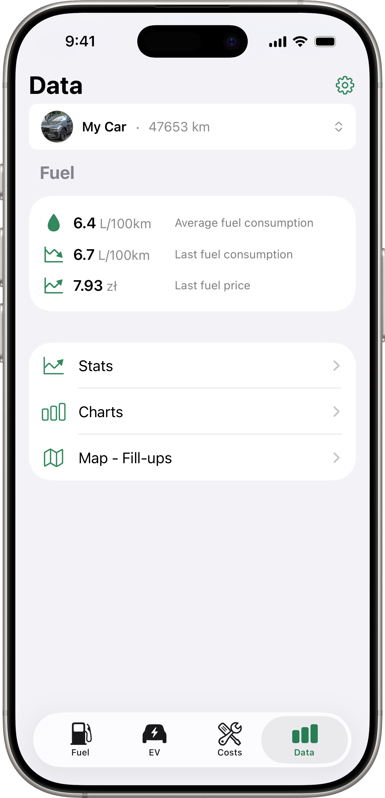
Trend Arrows
The icon to the left of each value shows whether the latest reading moved up or down compared to the one before it:
- Up arrow — value increased (consumption went up, or price went up).
- Down arrow — value decreased.
- Flat icon (grey) — no comparison possible yet (only one data point on file).
The arrow direction reflects what actually happened — there’s no “good” or “bad” colour coding.

Fuel + EV Together
For plug-in hybrids (vehicles with both a fuel tank and an EV component), the card appears twice — once under a Fuel header for fill-up data, once under an EV header for electricity bill data. Pure-fuel and pure-EV vehicles show only the relevant section.
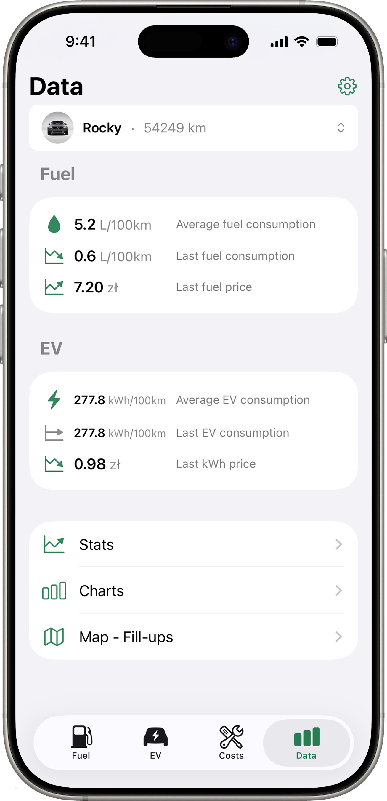
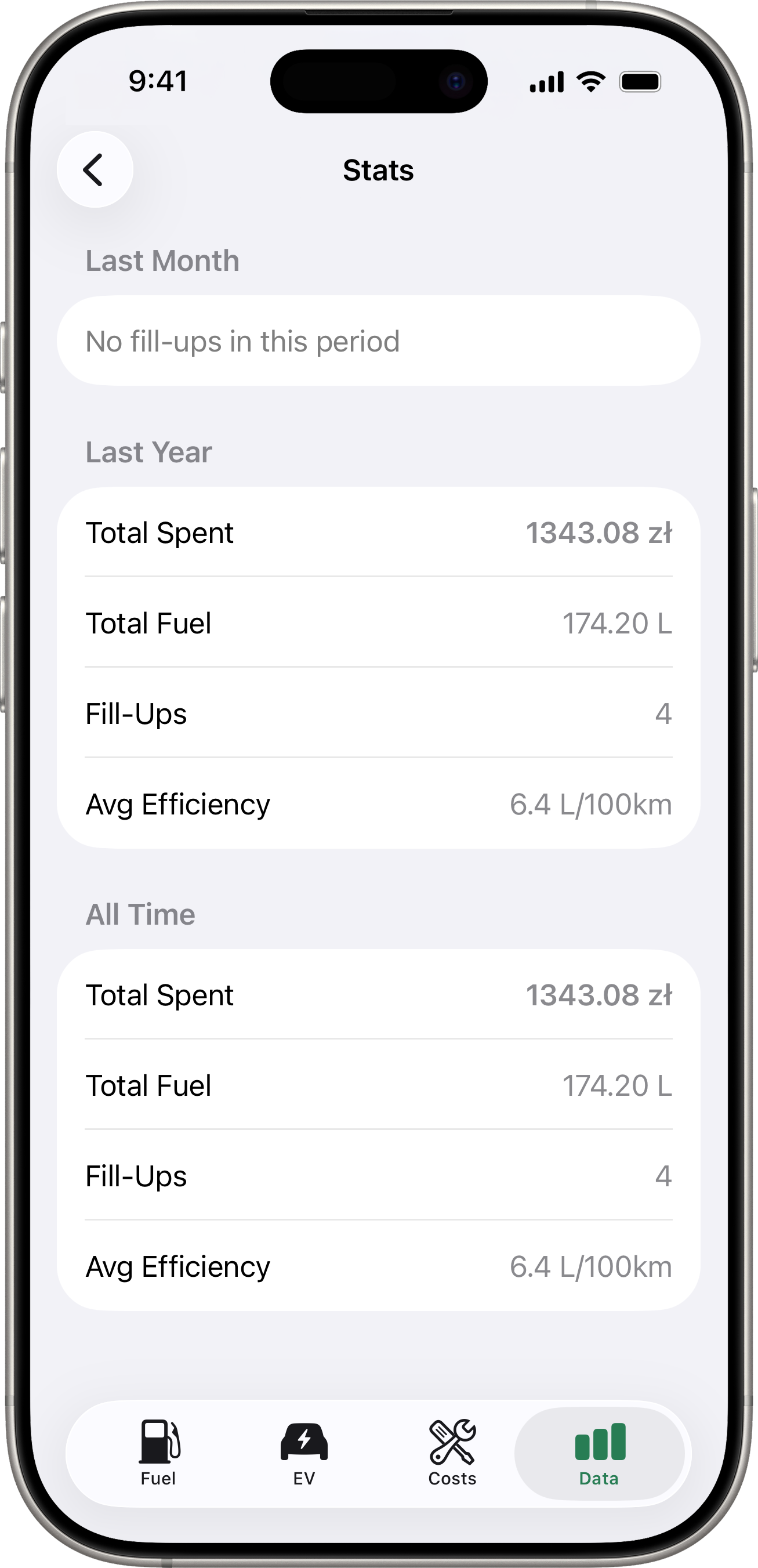
Stats
Tap Stats for a comparison of three time periods:
- Last Month — fill-ups in the last 30 days.
- Last Year — fill-ups in the last 365 days.
- All Time — every fill-up on file.
Each period shows:
- Total Spent — total amount spent on fuel.
- Total Fuel — total volume added.
- Fill-Ups — number of fill-up records.
- Avg Efficiency — average fuel efficiency, when computable.
If you have a default currency set, amounts are shown in that currency. Fill-ups recorded in other currencies are converted using the exchange rate at the time of the fill-up.
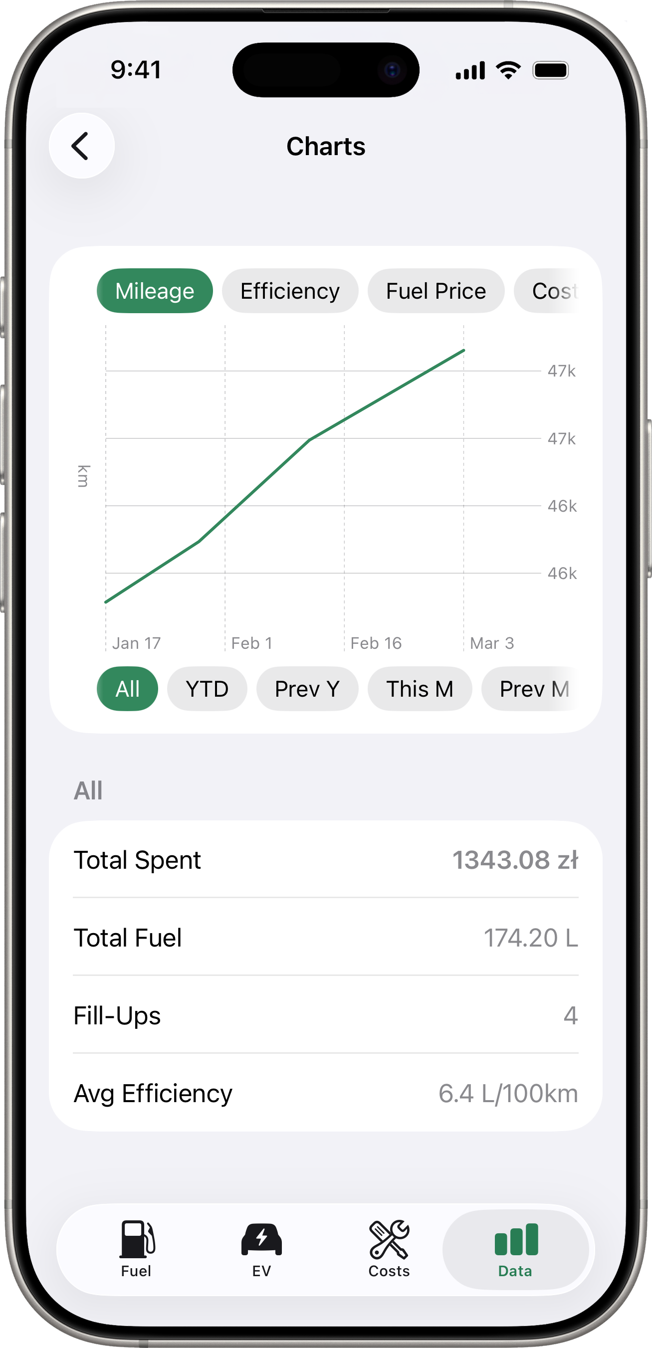
Charts
Tap Charts for a visual trend chart. You can switch between:
- Mileage — cumulative odometer over time.
- Efficiency — fuel efficiency trend.
- Fuel Price — price per unit trend.
- Cost/km — running cost per kilometre.
Use the period selector below the chart to filter by time range — All, YTD (year to date), Prev Y, This M, Prev M, or Custom (pick any start / end date). A summary section underneath shows total spent, total fuel, fill-up count, and average efficiency for the selected period.
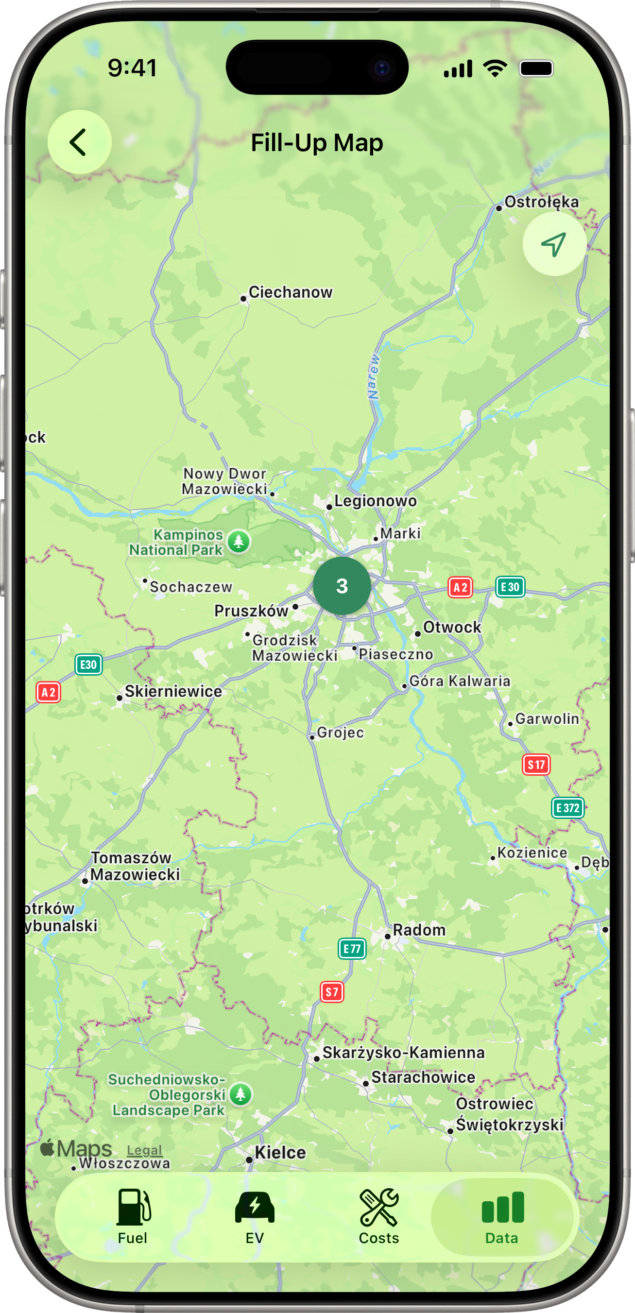
Map - Fill-ups
Tap Map - Fill-ups for a full-screen map showing every fill-up that has GPS coordinates for the selected vehicle. The map auto-centres and zooms to fit every pin. If the selected vehicle has no fill-ups with GPS data, an empty-state message explains how to enable it (see Fuel Tracking).
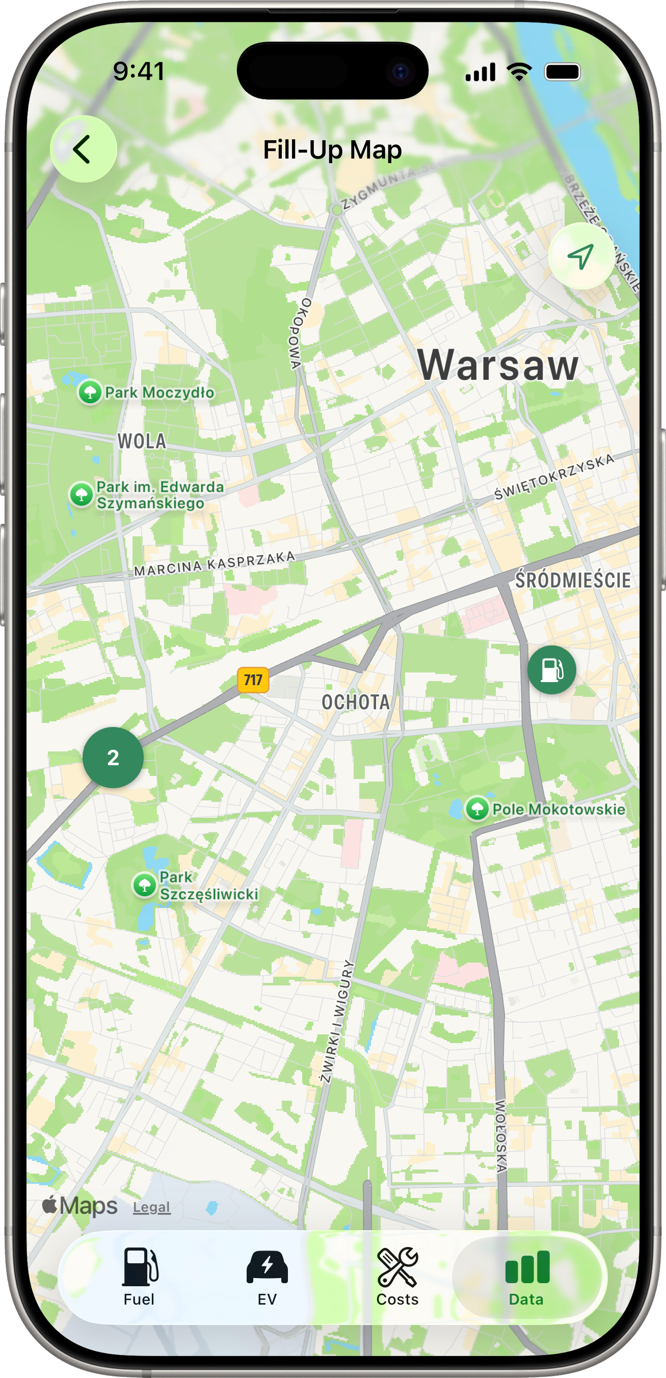
Pins and Clusters
- Single pin — a round accent-coloured circle with a fuel-pump glyph at a fill-up’s location.
- Cluster badge — when two or more fill-ups sit close enough together to overlap visually at the current zoom, they merge into a slightly larger circle showing the count (e.g. “3”, “8”) instead of separate pins. The badge sits at the cluster’s centroid.
Clustering recomputes whenever you finish a pan or pinch — pins re-group as the zoom changes.
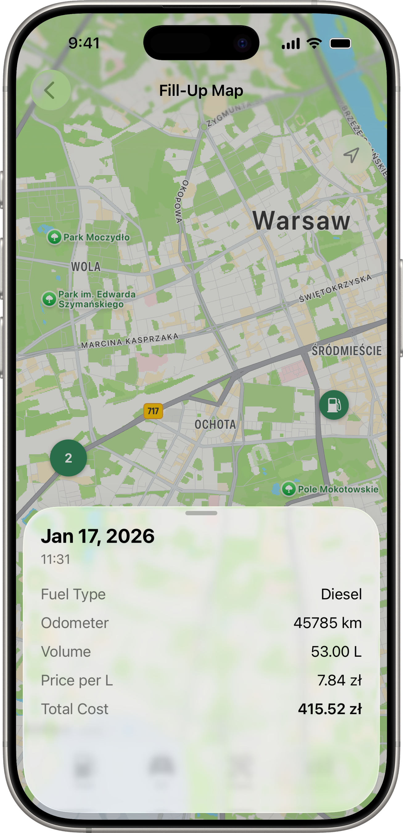
Tapping
- Tap a single pin → a read-only detail sheet slides up from the bottom showing that fill-up’s date, fuel type (when set), odometer, volume, price per litre, and total cost. Swipe down to dismiss. The sheet is browse-only — to edit or delete the fill-up, open it from the Fuel tab.
- Tap a cluster badge → the camera animates in to frame just the fill-ups in that cluster. The cluster typically splits into individual pins (or smaller clusters) at the new zoom. Repeat-tap to drill in further.
If two fill-ups are at exactly the same coordinates (e.g. the same gas station), they may stay clustered even at maximum zoom — open them from the Fuel tab in that case.
Switching Vehicles
Use the vehicle picker at the top of the Data tab to view data for a specific vehicle. Each vehicle has its own independent snapshot, stats, charts, and map.