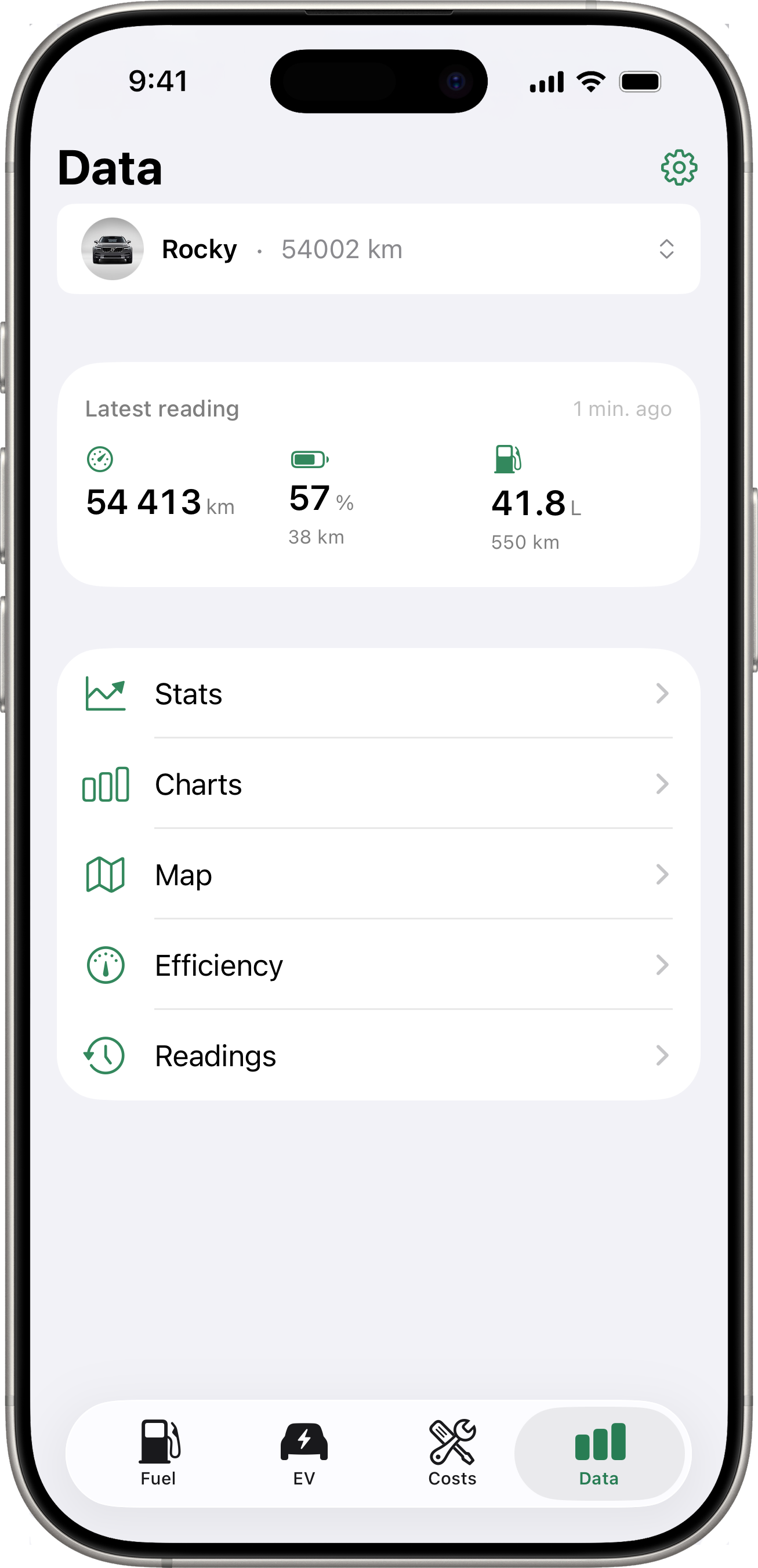
Data
The Data tab is the hub for everything analytical about the selected vehicle. It shows the Latest Reading card (for connected EV vehicles) at the top, followed by a list of pushable destinations: Stats, Charts, Map, Efficiency, and Readings.
Every detail screen below shows the vehicle’s name as a subtitle under its title so you always know which car you’re looking at.
Latest Reading Card
When the selected vehicle has a connected service integration that returns energy data (Volvo, Toyota EVs), a snapshot card sits between the vehicle picker and the menu list. It shows up to three at-a-glance metrics:
- Odometer (km / mi) — current mileage from the latest snapshot.
- Battery (%) plus an estimated remaining range if the API returns one.
- Fuel (L / gal) plus an estimated remaining range — for plug-in hybrids whose API exposes fuel level.
A timestamp on the right tells you how long ago the snapshot was taken.
Gestures
- Tap the card → opens the snapshot detail (every field returned for that snapshot).
- Long-press the card → triggers a manual fetch from the vehicle API. While the fetch is in flight, an inline spinner replaces the timestamp.
A welcome hint on first use explains both gestures. It dismisses itself the first time you use either.
For non-EV or non-connected vehicles, this card is hidden and the menu list starts right after the vehicle picker.
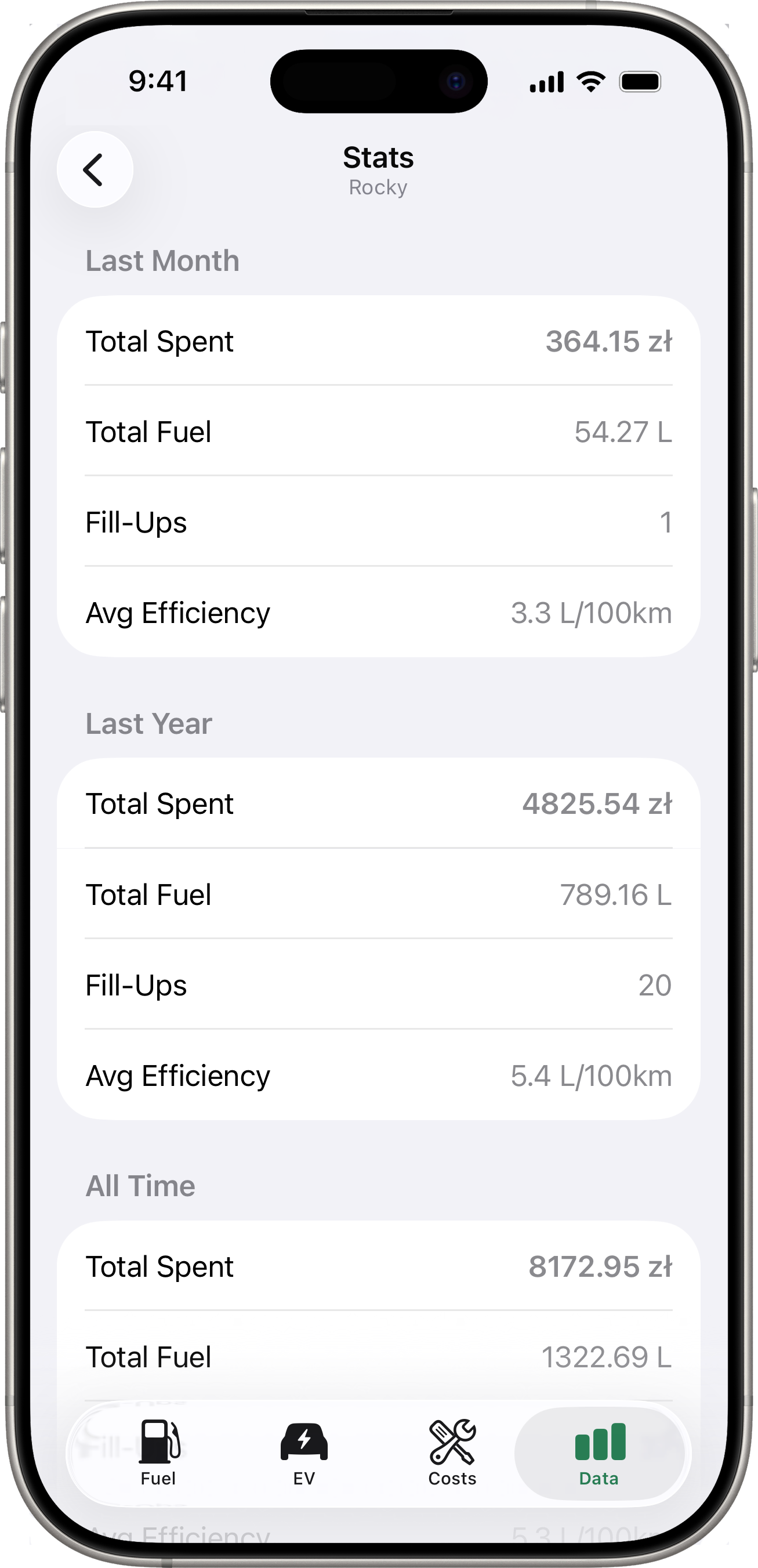
Stats
Tap Stats for a comparison of three time periods:
- Last Month — fill-ups in the last 30 days.
- Last Year — fill-ups in the last 365 days.
- All Time — every fill-up on file.
Each period shows:
- Total Spent — total amount spent on fuel.
- Total Fuel — total volume added.
- Fill-Ups — number of fill-up records.
- Avg Efficiency — average fuel efficiency, when computable.
If you have a default currency set, amounts are shown in that currency. Fill-ups recorded in other currencies are converted using the exchange rate at the time of the fill-up.
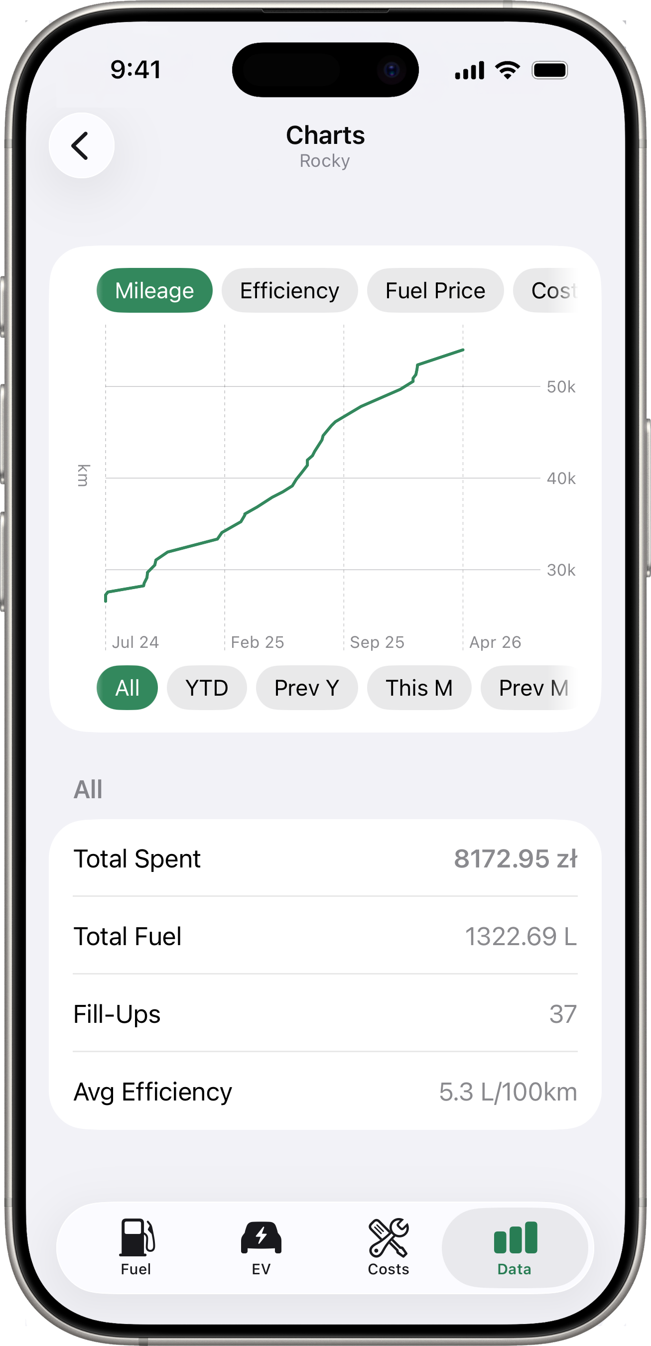
Charts
Tap Charts for a visual trend chart. You can switch between:
- Mileage — cumulative odometer over time.
- Efficiency — fuel efficiency trend.
- Fuel Price — price per unit trend.
- Cost/km — running cost per kilometre.
Use the period selector below the chart to filter by time range — All, YTD, Prev Y, This M, Prev M, or Custom. A summary section underneath shows total spent, total fuel, fill-up count, and average efficiency for the selected period.
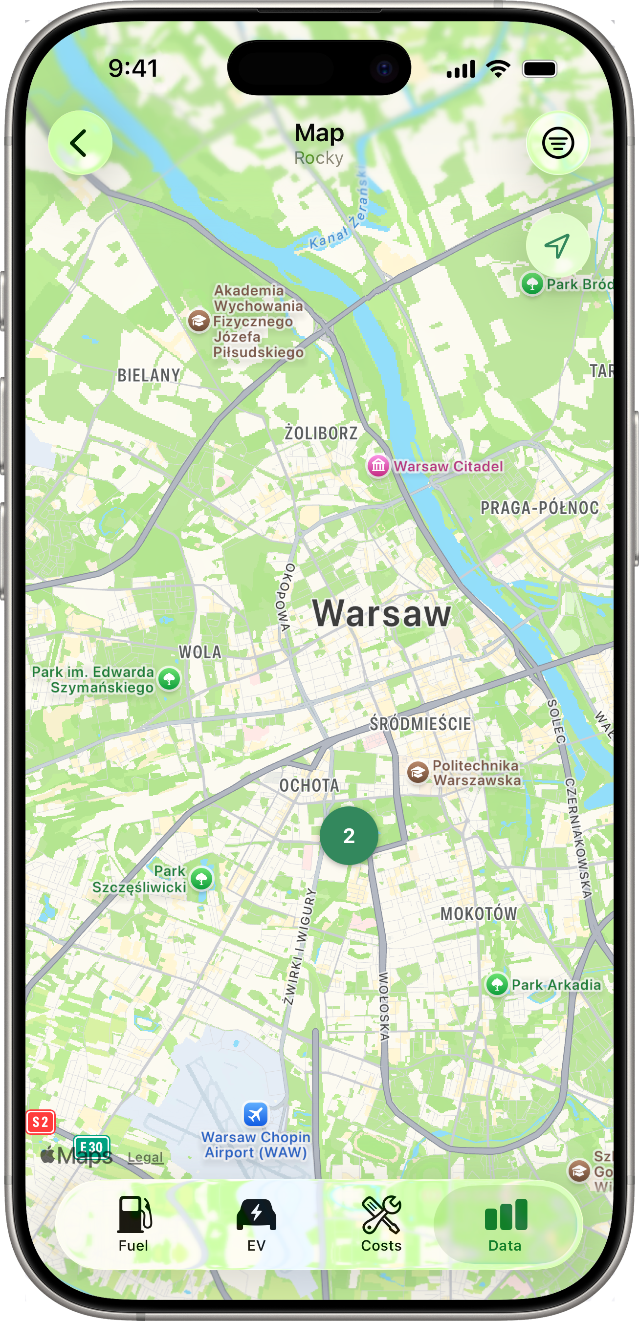
Map
Tap Map for a full-screen map showing every location-tagged record for the selected vehicle — fill-ups, costs, and charging sessions on a single map. The map auto-centres and zooms to fit every pin. If the selected vehicle has nothing geo-tagged, an empty-state message explains how to enable it (see Fuel Tracking → Location Capture).
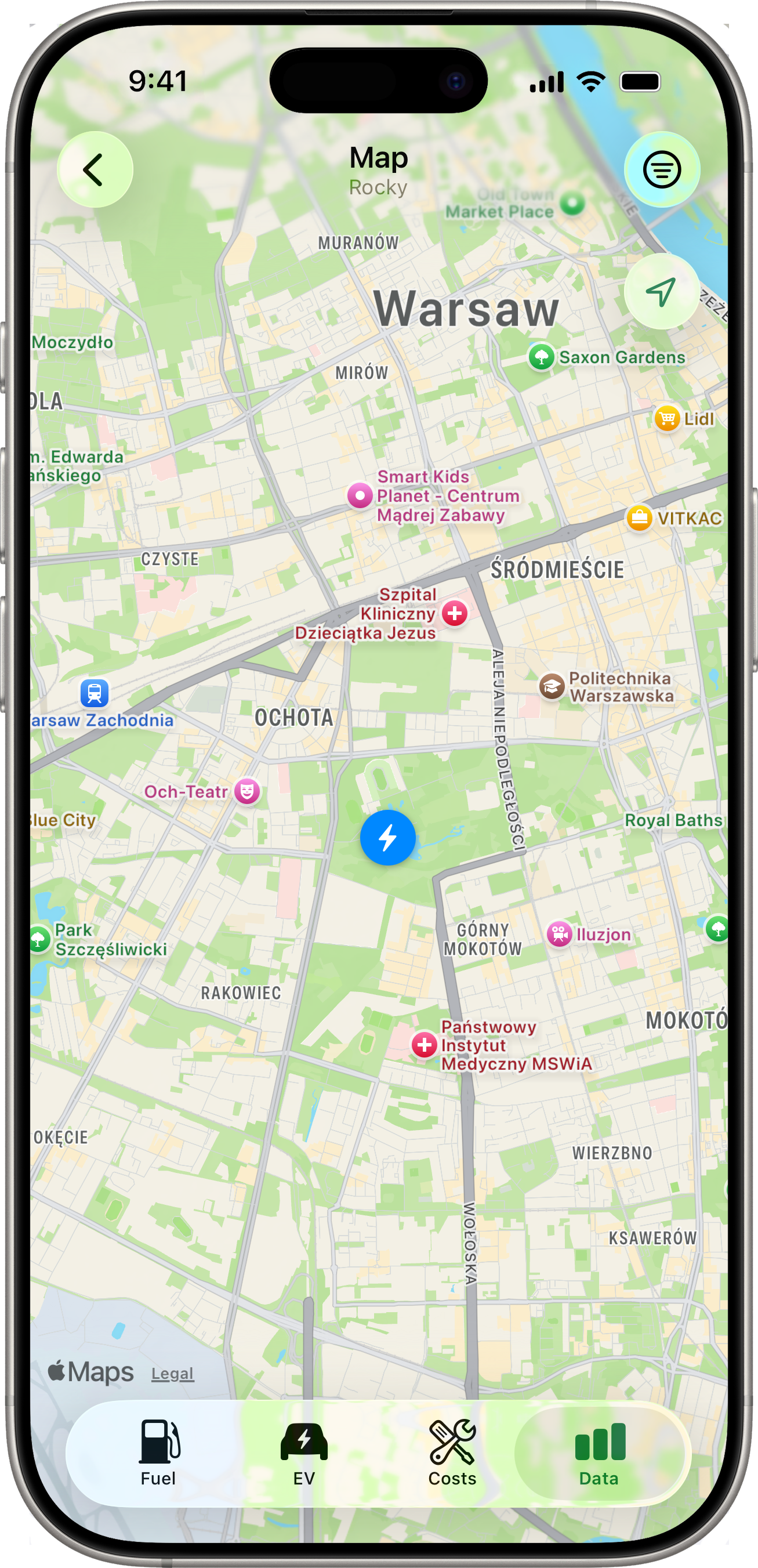
Pin Types
| Pin | Entity | Tint |
|---|---|---|
| ⛽ fuel pump | Fill-up | Accent (green) |
| 🔧 wrench | Cost entry | Orange |
| ⚡ bolt | Charging session | Blue |
A pin’s coordinate comes from the entity’s stored GPS — entries without a location are silently excluded from the map.
Clusters
When two or more pins (of any mix of types) overlap at the current zoom level, they collapse into a single round badge showing the count. Tap a cluster to zoom in; the pins will split into smaller clusters or individual pins as the camera moves. If pins share the exact same coordinate (e.g. several fill-ups at the same gas station), tapping the cluster instead opens a chooser list with mixed-type rows.
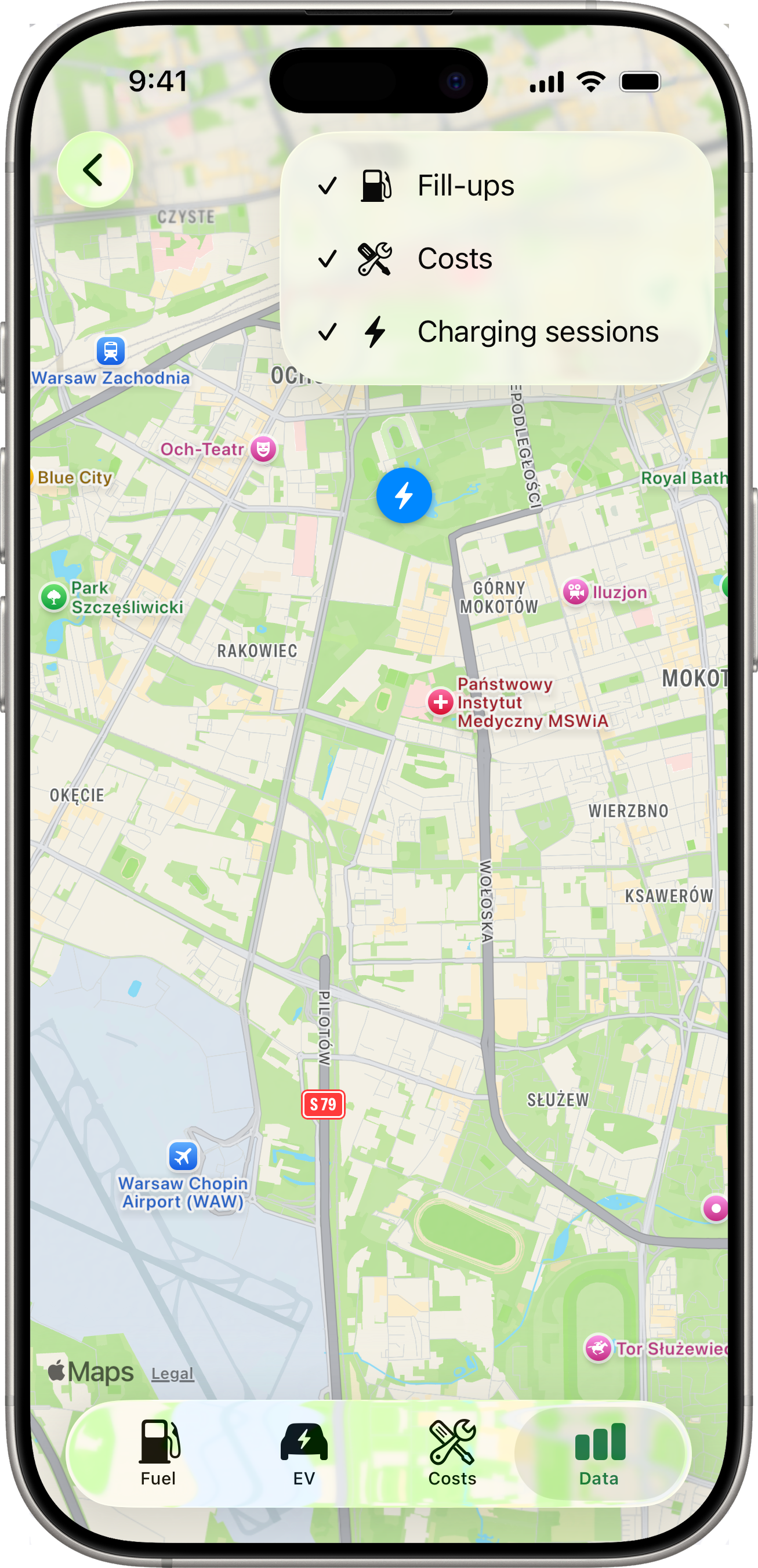
Filtering
A ≡ filter button sits in the toolbar (top-right). Tap it to reveal three toggles — Fill-ups, Costs, Charging sessions. Turn any off to hide that pin type from the map. The filter resets to “all visible” each time you re-open the Map (it isn’t persisted).
When all three filters are off, an inline empty state says “Nothing to show — turn a filter back on.”
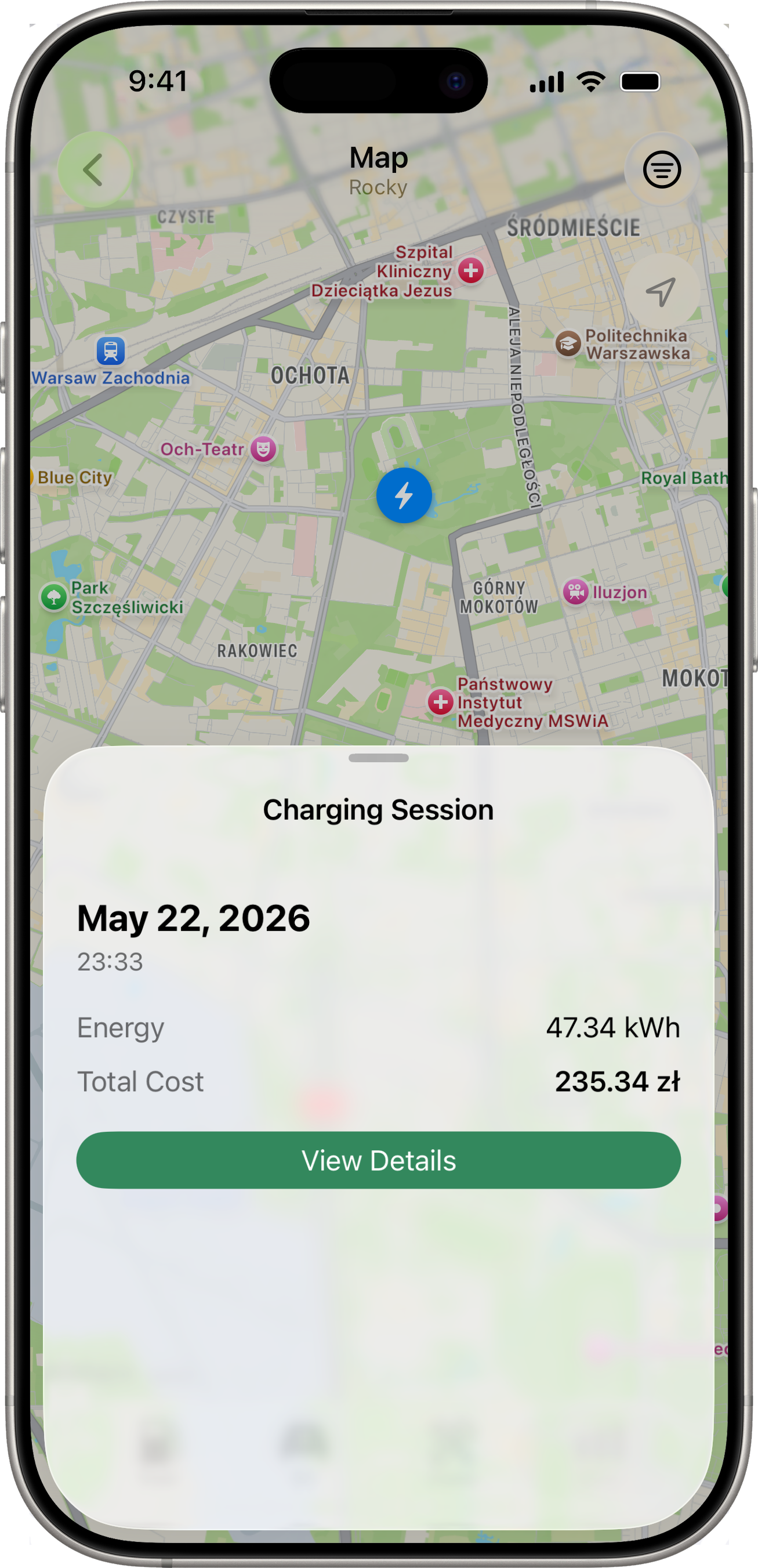
Tapping a Single Pin
Tapping a pin slides up a per-type detail sheet:
- Fill-up → date, fuel type, odometer, volume, price/L, total cost, plus a View Details button that pushes the full editable Fill-Up detail.
- Cost → date, category icon, amount, plus View Details to push the Cost detail.
- Charging session → date, location name (if set), kWh, total cost, plus View Details to push the Session detail.
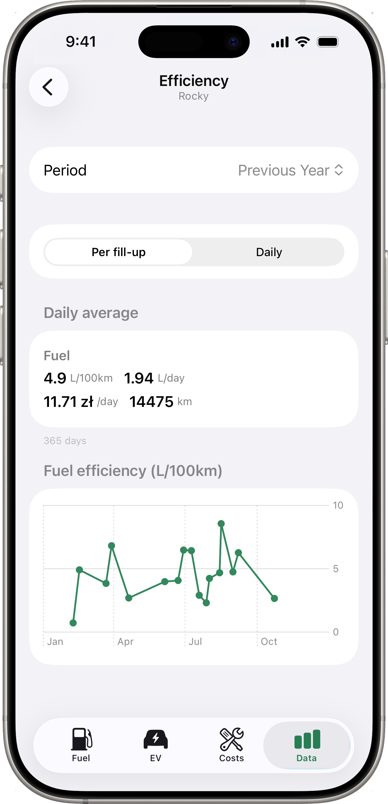
Efficiency
Tap Efficiency for a period-aware breakdown of fuel and EV consumption alongside one another. A Granularity toggle switches the chart between:
- Per fill-up / per bill (default) — one chart point per record.
- Daily — one point per day, derived from the snapshot stream (requires a connected service). For EVs without
Battery Capacity (kWh)set, the Y-axis iskm / %; with capacity set, the chart switches tokWh / 100 km.
A summary card at the top of the screen shows period totals and average consumption. The period picker matches the one on Charts.
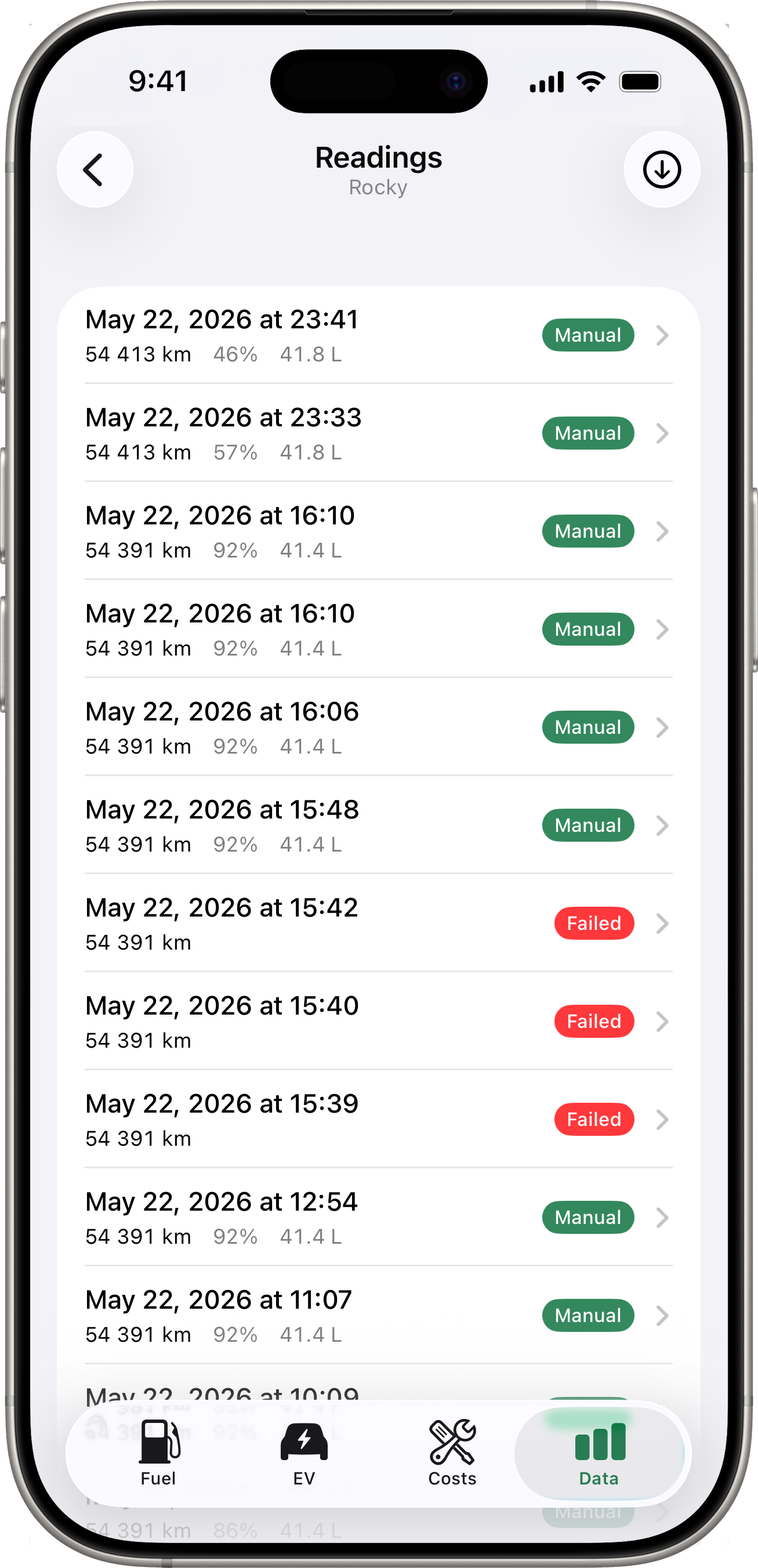
Readings
Tap Readings for a flat chronological list of every energy snapshot fetched from your connected services. Each row shows the timestamp, odometer, battery (and fuel where applicable), and a trigger badge:
- Scheduled (grey) — a routine background or Shortcuts fetch that succeeded.
- Manual (accent) — a user-triggered fetch (from the Latest Reading card long-press or the toolbar button on this screen).
- Failed (red) — a fetch attempt that didn’t produce a snapshot. The row’s subtitle shows the reason.
A toolbar button at the top-right of the list triggers a manual fetch on demand. Useful for testing that the integration is alive or for prompting an immediate snapshot before recording a fill-up.
Switching Vehicles
Use the vehicle picker at the top of the Data tab to view data for a specific vehicle. Each vehicle has its own independent Latest Reading card, stats, charts, map, efficiency, and readings list.